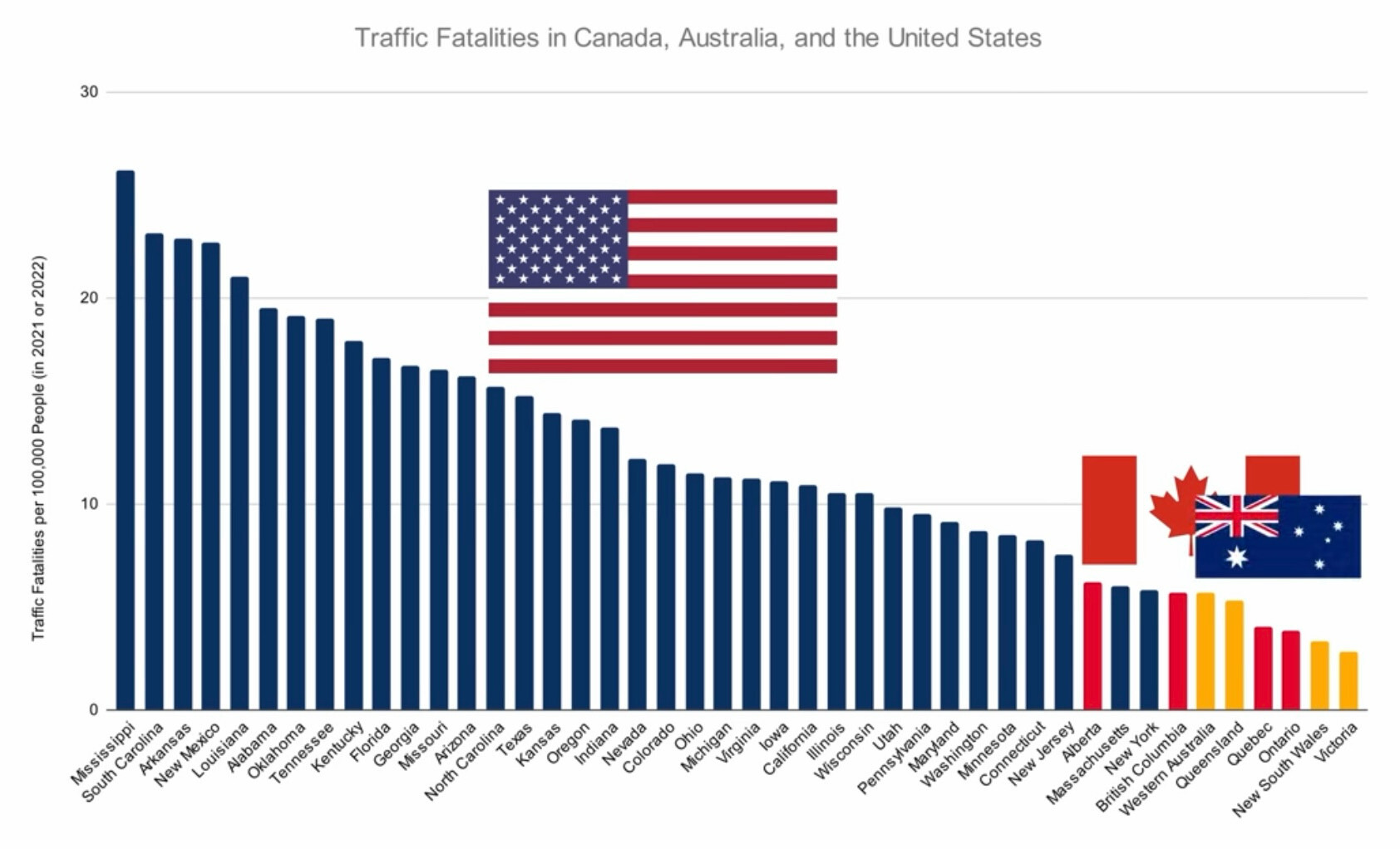
Davriellelouna@lemmy.world to Mildly Interesting@lemmy.world · edit-211 days agoRoad fatalities per 100,000 population in major US States, Australian States and Canadian Provinceslemmy.worldimagemessage-square130linkfedilinkarrow-up1444arrow-down112file-text
arrow-up1432arrow-down1imageRoad fatalities per 100,000 population in major US States, Australian States and Canadian Provinceslemmy.worldDavriellelouna@lemmy.world to Mildly Interesting@lemmy.world · edit-211 days agomessage-square130linkfedilinkfile-text
minus-squareFelixCress@lemmy.worldlinkfedilinkarrow-up2·11 days agoIs it the issue of safety standards?
minus-squareClanOfTheOcho@lemmy.worldlinkfedilinkarrow-up3arrow-down1·11 days agoI’m guessing there is some correlation to total miles(/km) driven. Not all of it, but some. If people in one location drive drastically less distance annually, I’d expect their numbers to show drastically lower on the chart, as well.
minus-squareFelixCress@lemmy.worldlinkfedilinkarrow-up2·11 days agoI am not convinced with Australia and Canada being much better? It would make sense if you were comparing to Europe.

Is it the issue of safety standards?
I’m guessing there is some correlation to total miles(/km) driven. Not all of it, but some. If people in one location drive drastically less distance annually, I’d expect their numbers to show drastically lower on the chart, as well.
I am not convinced with Australia and Canada being much better? It would make sense if you were comparing to Europe.